The 2026 interior Color story is about comfort with depth — blending nature-inspired tones with expressive accents to craft spaces that feel both serene and personal. Whether you aim for earthy warmth, refined cool hues, or vibrant accents, let your color choices reflect not just trends, but how you want to feel in your home.

Interior Color Trends of 2026
🟢 1. What Colors Are Trending in 2026
Interior design in 2026 is all about creating emotionally resonant, calming, and authentic spaces that balance comfort with personality. Experts and trend reports highlight a range of colors that are gaining traction this year:
🌿 Earthy & Nature-Inspired Tones
- Deep Greens & Muddy Greens — like sage, olive, and moss — bring a grounded, restorative feel to interiors.
- Warm Earth Neutrals — such as terracotta, clay, sand, and brown — are replacing cooler grays and adding warmth and depth.
🎨 Calming & Sophisticated Hues
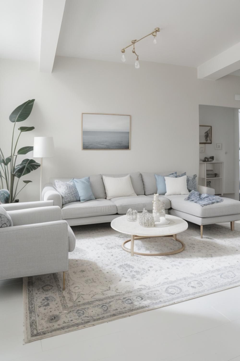
- Soft Neutrals & Whites (like Pantone’s Cloud Dancer) provide a serene backdrop that makes spaces feel open and peaceful.
- Cool Teals and Blues lend a soothing, sophisticated touch, especially in living rooms and bedrooms.
✨ Rich Accent Shades
- Jewel-Inspired Tones — deep burgundy, plum, and ruby — add drama and personality without overwhelming.
- Soft Pastels (like blush pink, lilac, and butter yellow) bring gentle, uplifting vibes.

🧠 How Colors Influence Mood & Atmosphere
The colors you choose directly affect how a space feels and functions — psychologically and visually.
🌱 Warm Earth Tones
- Effect: Cozy, grounding, and reassuring.
- Best For: Living rooms, family areas, spaces meant for relaxation or socializing.
- Why It Works: Earthy hues mimic nature, promoting comfort and stability.
🌊 Blues & Greens
- Effect: Calming, soothing, and refreshing.
- Best For: Bedrooms, home offices, bathrooms.
- Why It Works: These shades are linked to tranquility and balance, helping reduce stress.
🕊️ Soft Neutrals & Whites
- Effect: Airy, bright, and spacious.
- Best For: Small rooms or open-plan spaces.
- Why It Works: Light neutrals reflect light and make interiors feel larger and more peaceful.
💎 Rich, Deep Accents
- Effect: Dramatic, sophisticated, and expressive.
- Best For: Feature walls, accent pieces, or furniture.
- Why It Works: Deep tones add character and depth without dominating a room.

🎯 How to Choose the Right Color Scheme
Here are practical tips to ensure your color decisions create the feel and function you want:
🏡 1. Start With Purpose
Think about how the space will be used.
- Relaxing areas benefit from soft greens, blues, or neutrals.
- Social spaces can handle richer earth tones or joyful accents.
💡 2. Consider Lighting
Natural and artificial light changes how colors look:
- Bright light makes colors feel more vibrant.
- Warm lighting enhances earth tones and deep hues.
🎨 3. Balance Neutrals With Accents
Use neutral walls as calm foundations, and add personality with accent walls, textiles, art, or decor in trending colors.
🧩 4. Harmonize With Materials
Pair trending colors with materials like wood, brass, stone, or woven textures to enrich the palette and create cohesive design narratives.
🪩 5. Test Before Committing
Always sample paint or textiles in the actual room. Colors can shift dramatically with lighting and surrounding surfaces.
Find us on Google – https://share.google/IZUJEfmj1JaAOfZJD
Green and Young Interiors Awards –https://greenandyoung.in/achievemets/